Set on Royalty
The shade of blue that rules.
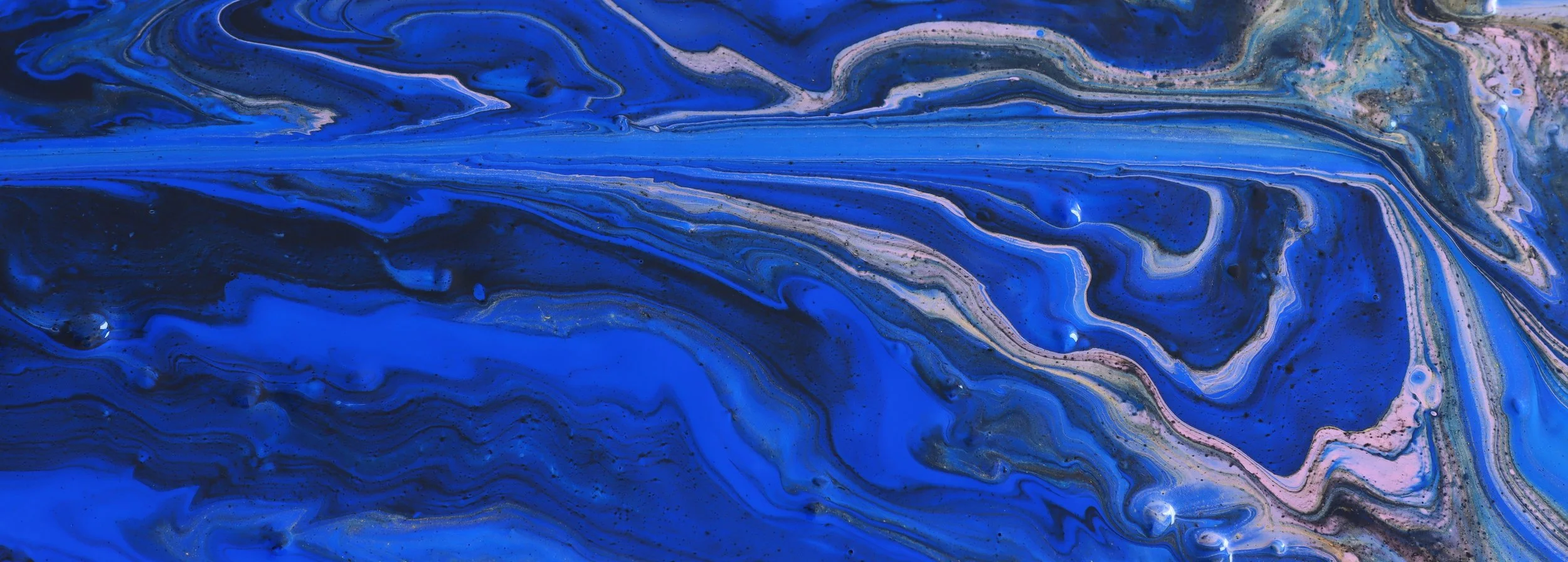
Royal Blue: The Color With Main Character Energy
Royal blue gets its name from its historic connection to royalty. The shade was created to be bold, elegant, and memorable, which makes sense because “regular blue” apparently was not dramatic enough.
Because royal blue is vibrant and clean, it works well as both a statement color and an accent. It pairs nicely with white, gold, silver, yellow, red, and even soft neutrals. In other words, royal blue knows how to get along, but still wants top billing.
Royal blue pairs especially well with white, gold, silver, and yellow.
It can feel bold, professional, energetic, or classic depending on how it is used.
Royal blue is a popular choice when a design needs to feel strong and clean.
It has a crisp, high-contrast look on light backgrounds.
The color gives off “important, but still fun” energy.
Royal blue is the overachiever of the blue family.
It is brighter than navy, deeper than sky blue, and just dramatic enough to make a button, banner, or headline feel important. If colors had job titles, royal blue would be the team captain. It is dependable, confident, and somehow makes everything around it look a little more official.
Royal blue is great for designs that need a little energy without going full neon. It brings color, contrast, and a polished feel all at once. This shade has a classic look, but it does not feel stuck in the past. Royal blue can look modern, sporty, regal, corporate, or playful depending on the fonts, graphics, and colors around it. Royal blue is not shy. It knows it looks good on a sign, a website, a uniform, a logo, and probably a cape.
Royal Blue: The Color With Main Character Energy
Royal blue gets its name from its historic connection to royalty. The shade was created to be bold, elegant, and memorable, which makes sense because “regular blue” apparently was not dramatic enough.
Because royal blue is vibrant and clean, it works well as both a statement color and an accent. It pairs nicely with white, gold, silver, yellow, red, and even soft neutrals. In other words, royal blue knows how to get along, but still wants top billing.
Royal blue pairs especially well with white, gold, silver, and yellow.
It can feel bold, professional, energetic, or classic depending on how it is used.
Royal blue is a popular choice when a design needs to feel strong and clean.
It has a crisp, high-contrast look on light backgrounds.
The color gives off “important, but still fun” energy.
Royal blue is connected to Royalty.
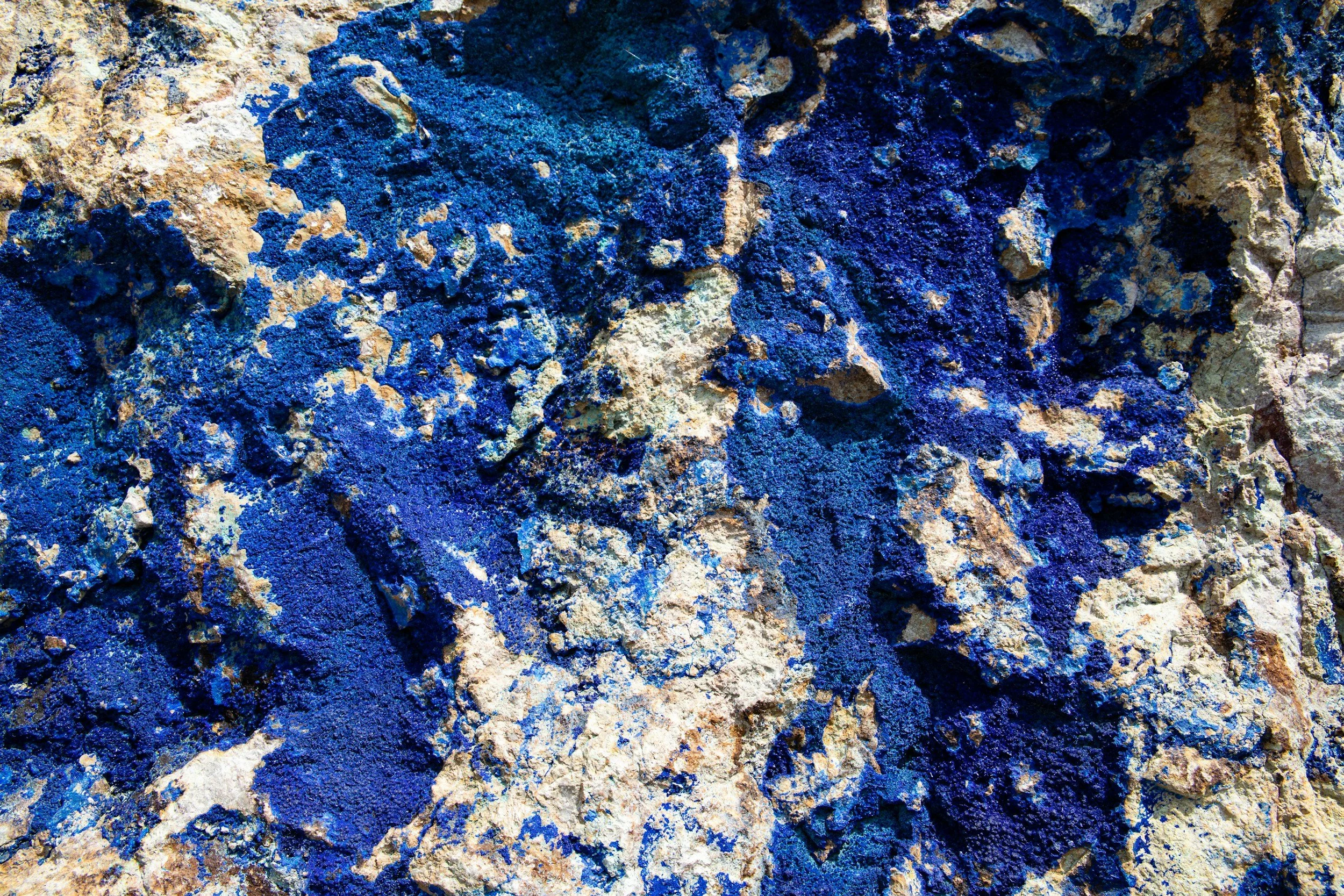
Royal blue has a long history tied to status, luxury, and attention-grabbing design. Before modern pigments made bright blues easier to produce, rich blue colors were rare and expensive. That made deep, vivid blues feel special, important, and closely connected with wealth, power, and royalty.
One of the most famous sources of blue in history was lapis lazuli, a deep blue semi-precious stone that was ground into pigment to create ultramarine. This pigment was incredibly valuable and was often reserved for religious art, royal portraits, and important decorative work. Basically, if a painting had a rich blue made from lapis lazuli, someone probably spent serious money to make it happen.
Royal blue is a bright, vivid shade of blue.
It is often associated with confidence, trust, and loyalty.
The color has historic ties to royalty and elegance.
Royal blue is commonly used in logos, uniforms, flags, and sports branding.
It stands out more than navy but feels more polished than lighter blues.